

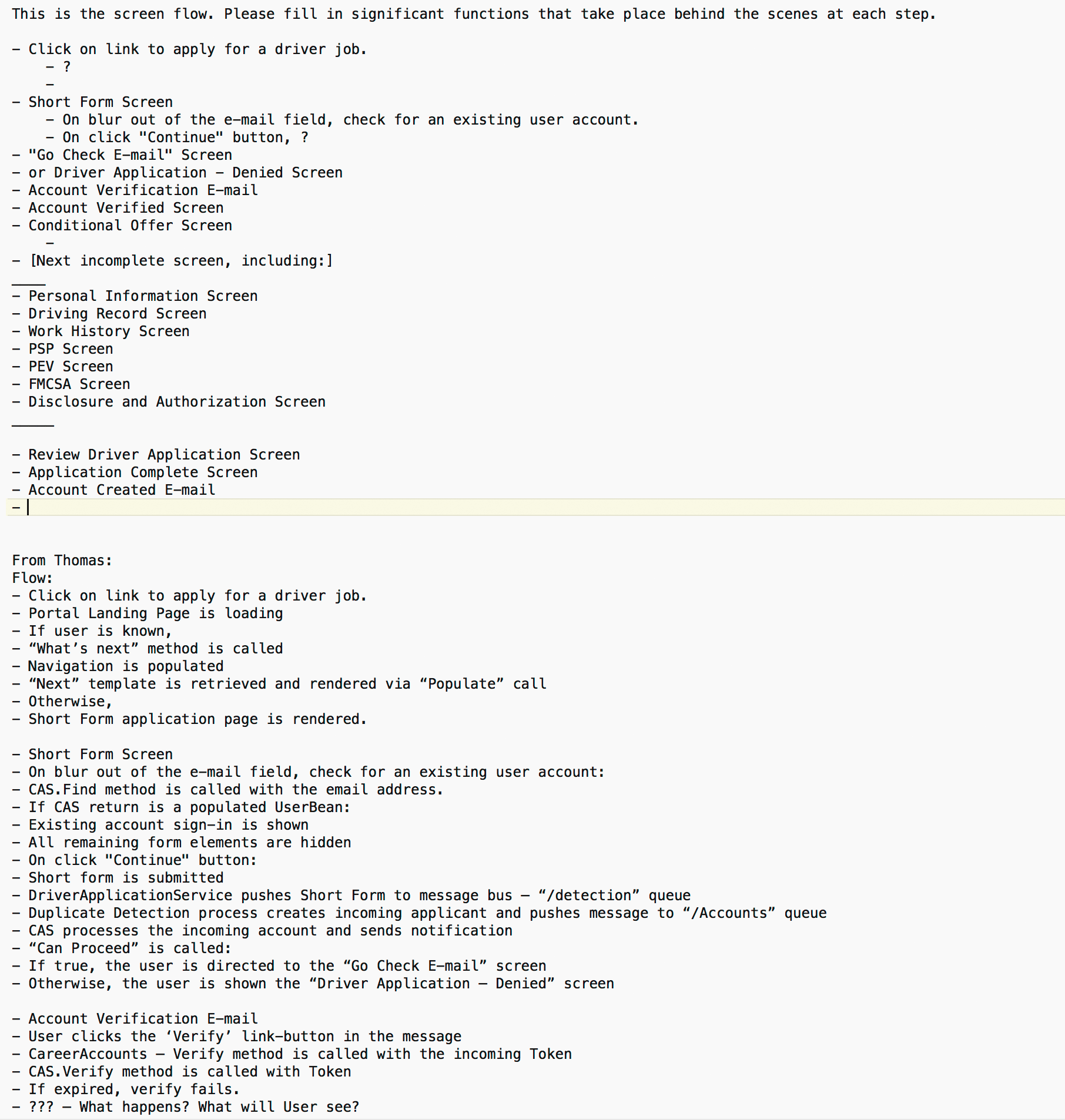
Mastering Forms
Suggested Takeaway
As the most intensely interactive element of web apps, forms, like no other element, can ruin or win the user experience. My exploration, as never before, into everything that makes forms usable, helped me achieve mastery of form design.
Project Overview
It is a little-known fact about the trucking industry that two of its primary business challenges are hiring and retention. Among other reasons for high turnover, it seems most have to try it to learn that the lifestyle is not for them. With a driving force of several thousand, C.R. England must hire hundreds of drivers each week just to stay even.
Only a small fraction of the thousands of applications submitted each week will qualify. With that volume of applications to process, and given the onerous number of forms required for the trucking industry, the amount of friction in the process has a huge impact on the bottom line.
A few of the existing forms were digital, but most were paper. There was no common repository for all forms. Applicants had no access to forms once they were submitted, so changes were difficult and created tracking and authorization issues. Costs multiplied with errors and inconsistencies in data. The burden on applicants was so heavy that only a small fraction of those who began the process saw it through to the end.
The project was ambitious, but it was the necessary course. We would build a Career Portal which would be the touch-point for applicants all the way from application start through completion of all hiring documents. Additionally, the portal would be used throughout the drivers' careers with C.R. England to maintain documents and personal informtion related to their careers. Features of the project included
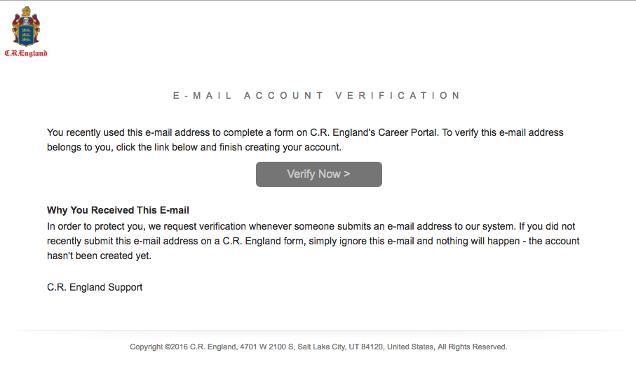
- Management of the applicants' sign-in credentials
- Maintaining the status of documents and displaying it to the applicant
- Allowing the applicants to edit their documents
- Triggering processes on document submission
- E-mail notifications to applicants for next steps when other processes complete
The project also involved
- Integration with an existing Sharepoint CRM
- Integration with an existing 3rd party document management and archival system
- Integration with a 3rd party financing system
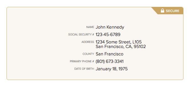
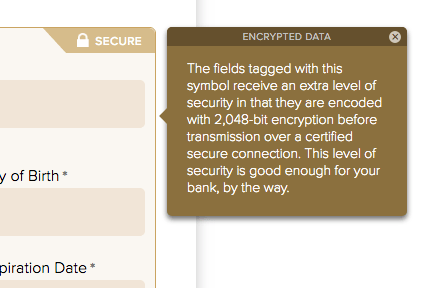
- Security of personally identifiable information (PII)
Timeline
I had 2½ months to spend on the design before any development began. This was unprecedented at C.R. England, but this project was deemed to be extremely valuable to the success of the company. I continued to work after coding began to facilitate handoff and handle new issues that arose. My time devoted to this project tapered off to almost nil after the first 2 months of development, but I stayed available throughout and attended meetings as needed. There were 6 months slated for development, which we ended up exceeding by only a few weeks. Because of its size and complexity, consisting of several very difficult "sub-projects", it was dubbed "The Four Horsemen of the Apocalypse". For the launch of the Career Portal, I travelled to C.R. England's Texas school for a week to help students and administrators with the new system and to get valuable feedback.
My Role
I was the sole designer on the Career Portal project. I had responsibility over the entire user experience, including every aspect of user flow; interactivity; page design; and much of the verbiage on Career Portal screens and e-mail notifications. I delivered functioning HTML, CSS, and Javascript of all 61 screens and all 8 e-mail notifications.
The Problem
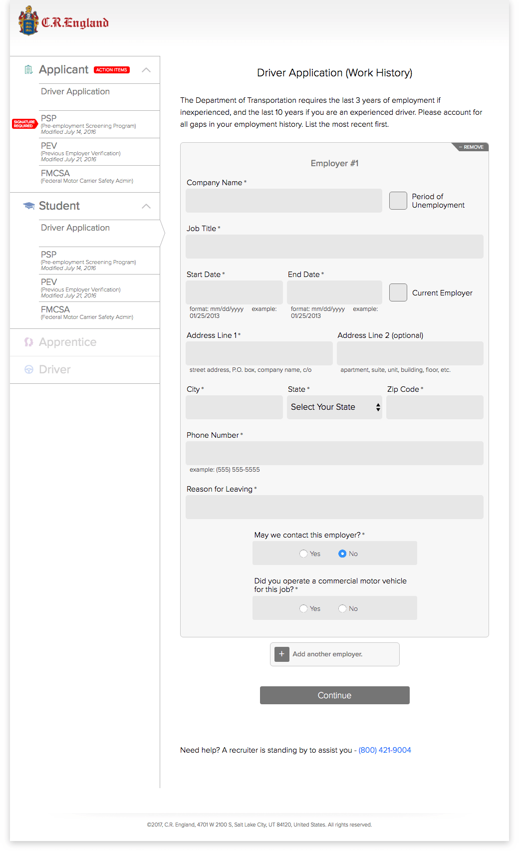
In a phrase, reducing friction was the overarching goal for the user experience design of the Career Portal. Even a 2-field sign-in screen can be burdensome if it is designed poorly. With its numerous forms, the Career Portal would depend heavily upon optimized form design for success.
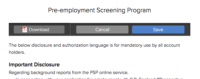
There were several text-heavy sections as well—disclaimers and legal agreements. We needed to minimize this burden on users.
Personas
Truck drivers, or more precisely, applicants to drive truck, come in all shapes and sizes. I was surprised how many drivers I met that used to be computer programmers but gave it up for the freedom and adventure of trucking. They come with all kinds of pasts, at every education level, young and old, male and female, from every corner of the country. What could we assume about this group as it pertains to determining our design goals?
- They may not be computer literate (it is not a requirement for the job).
- They may be down and out, since trucking is often a career choice of last resort.
- They will likely have form fatigue from applying to other positions.
- They would likely be using a mobile device. According to analytics for the existing application, such as it was, 70% of those who started the application did so on a mobile device.
Actions
The actions users would take were
- Filling out forms
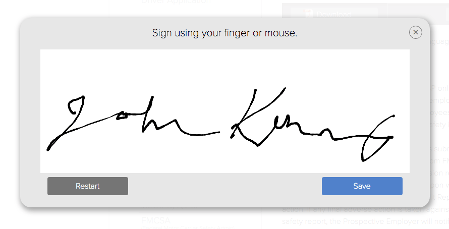
- Electronically signing forms and agreements by capturing graphic input from finger or mouse
- Saving and submitting forms
- Signing in and out
- Navigating to particular forms
- Downloading the forms as PDFs

The Solution
Forms
Reduction
With the goal of reducing the burden on the job applicants, beyond removing as much friction from their process as possible, huge gains could be had by reducing the number of forms and agreements the user had to deal with to begin with. Fortunately, the business analyst was on the same page with me on this, and she was in tight with all of the people from the many departments with interests in the various parts of this project. Together, we vigorously fought to eliminate any form that did not absolutely have to be included. What's more, from the remaining forms, we fought to remove any field that was not needed.
This required tracking down the subject matter expert for each form, as well as the person with the authority to approve our requests. In many cases it was the company's lawyers. Other times it was someone over the schools, financing, operations, recuiting, safety, or even an executive. These gains were hard-fought, but we knew that each one would pay off through every system that followed, in perpetuity. I remember great rejoicing when, well into the coding phase, we finally received permission from corporate counsel to remove one of the more onerous forms. Our hearts were really in this battle; and our hearts were with the applicants.
Removing Friction
I had been designing forms for my entire design career, which predated the web with my work as a graphic designer. My very first design project was redesigning a classified ad form. To solve the problems people had been having with the existing form, I knew intuitively that I needed to empathize with the user. I observed them. I talked with them—interrogated them, really. I placed ads myself. I became them.
When the web came along, forms got more interesting. I already viewed print design as being interactive; I imagined a conversation happening between the reader and the page. But the interactivity of the web added multiple dimensions of interactivity to what I was working with before. It was thrilling to me. I've always recognized that the form was the most intensely interactive element in web apps. Perhaps interactive games have more interactions, but in designing web pages for business purposes, forms are where it all happens. And if a form is designed poorly, then someone is going to suffer. And that always translates to a failure to achieve business goals.
Going into the Career Portal project, I felt very confident in my ability to design effective and usable forms. But the sheer number of forms and fields the applicants would have to cope with, and the high volume of applicants, warranted that I thoroughly review every aspect of form design to assure that I employed every UX design principle to its fullest to create the most usable forms imaginable.
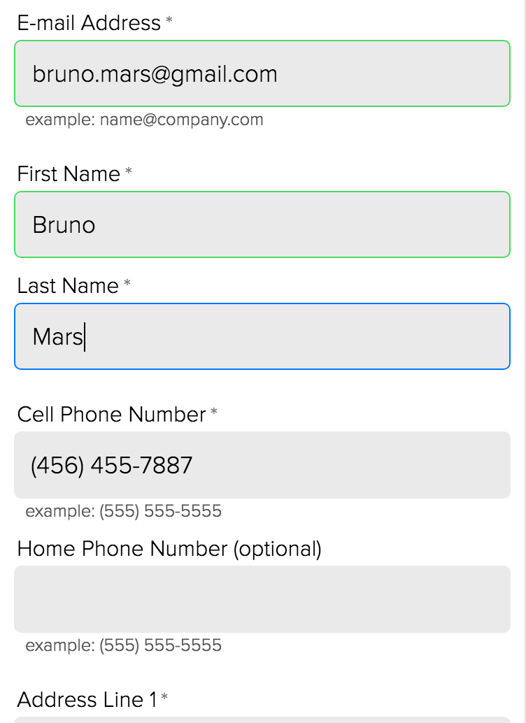
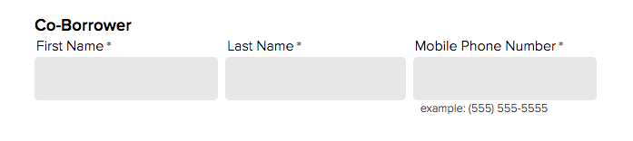
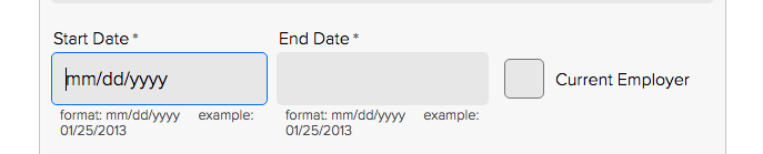
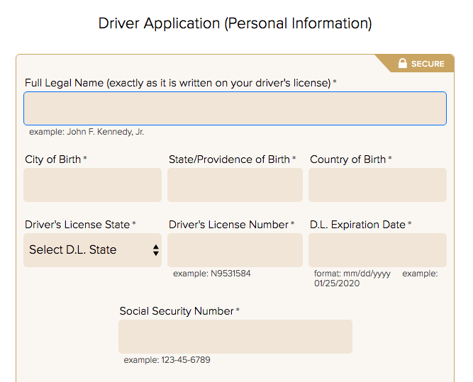
I addressed every aspect of the forms, including
- Layout—aligning and grouping of fields to communicate relationships
- Labels—using unambiguous wording; maximizing legibility
- Controls—optimizing size and behavior for touch; maximizing legibility; input masks
- Helper Text—concise and clear text to remove all doubt
- Placeholder Text—answering once and for all if it helps or hurts
- Buttons—optimizing size and behavior for touch; maximizing legibility
- Button Groups—ordering and positioning for smoothest flow
- Mobile Design—every aspect of the design reconsidered for each device type
- Validation—when to validate; positioning; appearance; wording; writing rules
Text
After paring down the number of disclaimers and legal agreements to include, I sought to make what was left as user friendly as possible. Very recently we've seen some businesses start to reword their legal texts to sound more human without comprimising the ability of the text to legally protect the parties involved. I presented this idea to our lawyers and was pleasantly surprised that they were happy to do it. I also formatted the text in ways that were designed to ease the cognative load and friction on the users. Most legal text is deliberately made difficult to read, and then snuck past the user as inconspicuously as possible. From the beginning of the project I promoted the idea that easy-to-read legal text was better for both the applicant and the company, and I ultimately prevailed.
Results
It was so satisfying to be at the school in Texas for the launch and see first hand the impact our work was having on administrators and students. It was apparent immediately that this was a game-changer that would touch so many people's lives and have a significant impact on our company's profitability.