An E-Commerce Redesign
Suggested Takeaway
A complete transformation of the user experience, from ineffective to effective, can be done quickly by someone with the right skillset.
Project Overview
Premier Medical Distribution started in 1992 as a family-owned and operated business which has grown by leaps and bounds ever since. They ventured into e-commerce very early in the history of the web with PointForce, a Windows-based content management system (CMS), which served up HTML snippets and modules written in ProvideX, a derivative of the BASIC programming language. The markup used conventions from the mid-90s, including layout done entirely with tables. The CMS was integrated with all of the business systems, which meant we could not just scrap it and throw up a WordPress or Magento site. Due to the prohibitive costs of the CMS provider, I had to work within and around the existing code with only minimal changes from them. PMD’s web site was their primary branding interaction with their clients, making the look and experience of the utmost importance.
The Problem
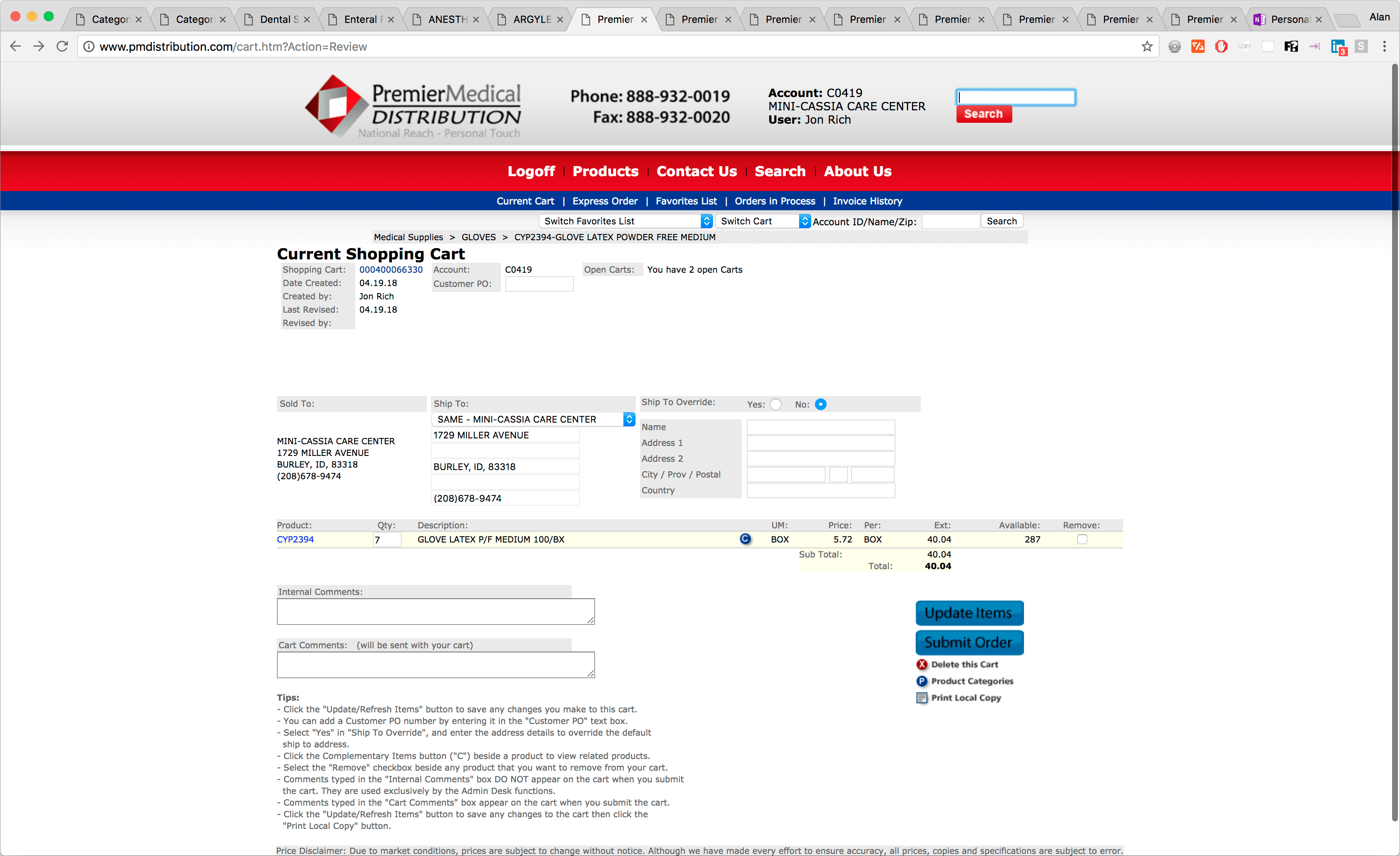
The site was over 20 years old—and it looked it! It did not seem to have much design consideration to begin with, and the passage of time showed this more starkly. It looked like it was old, and the user experience made it a chore to do business with PMD.
My Role
STG assigned me as the sole developer, charged with UX design, UI design, and coding HTML, CSS, and Javascript, all skills which I have used since their inception on the web. I was really excited to give PMD a brand new look that would make their image shine and to transform their users’ experience from frustrating to a sheer pleasure.
Timeline
Estimated Time: 3-4 weeks
Actual Time: 5 weeks
Reasons for Discrepancy:
- additional screens discovered
- additional functionality desired
- obstacles discovered in integration with CMS
Personas
There are 2 main types of users of pmdistribution.com:
- Medical Supply Purchasers from a wide variety of companies ranging from home healthcare to hospitals, throughout the country. These
- Constitute the vast majority of usage scenarios and are in almost every respect the same as e-commerce users in general.
- Are comprised of adults of all groups found in the medical profession in the United States.
- Shop in the capacity of their work.
- Are motivated by a desire to accomplish the company’s purchasing tasks quickly, reliably, and inexpensively.
- Are usually very knowledgable about the products they need.
- Use HCPCS codes, product names, product descriptions, and product images to identify products.
- Search by Product Name, Product Code, HCPCS code, or Keyword.
- Frequently reorder from the same set of items.
- Accountants (from clients’ Accounts Payable) who review orders in progress and invoice history, can approve users’ carts. These
- Constitute a smaller, yet significant number of overall users.
- Includes adults of all groups found in the medical profession in the United States.
- Are concerned with ease of finding orders, invoices, and line items, verifying accuracy, and having confident interactions. Therefore, their prioritized needs are: a clear hierarchy of information, legibility (particularly in data tables), and clear categories and labels.
Note that the anonymous visitor is deliberately and decidedly not a persona for this web site, hence no need to add items to a cart before signing in nor to sign up.
Actions
The initial actions users would take, in order of frequency, were
- Search
- Use Favorites List to create an order
- Use Express Order to create an order
- Browse products by category
The other key actions included
- Add to Cart
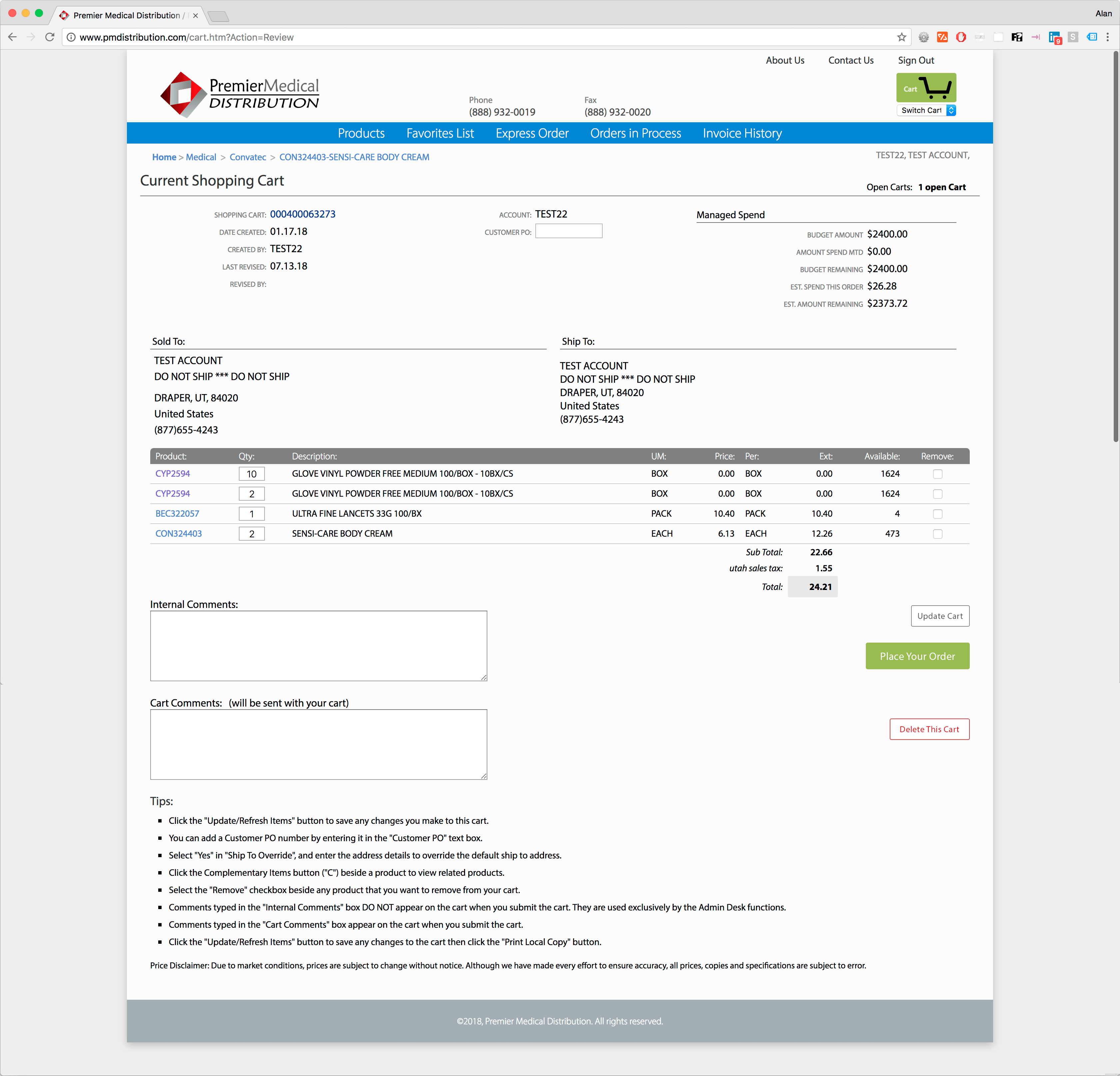
- Place Your Order
The Solution
There were 2 distinct challenges to this project.
- Design a modern-looking, well-branded, and very usable e-commerce site tailored to Premier Medical’s products and clientele.
- Code the design into an ancient and crippled content management system while maximizing functionality and priorities of the design goals.
Design
User Experience Design
I will call out a few of the key usability improvements I made. There are countless decisions I made, small and large, that affect the usability. These few will give you a sense of them.
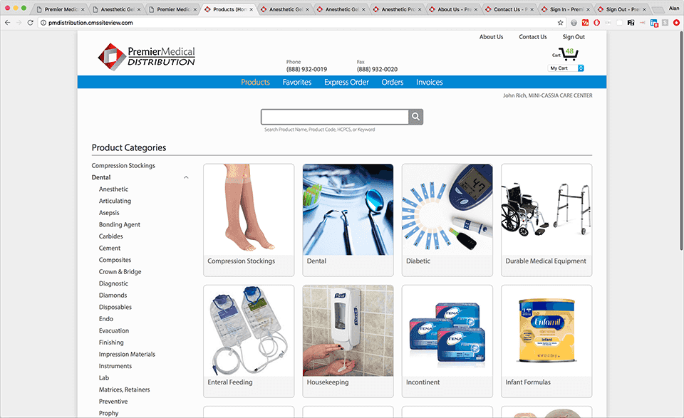
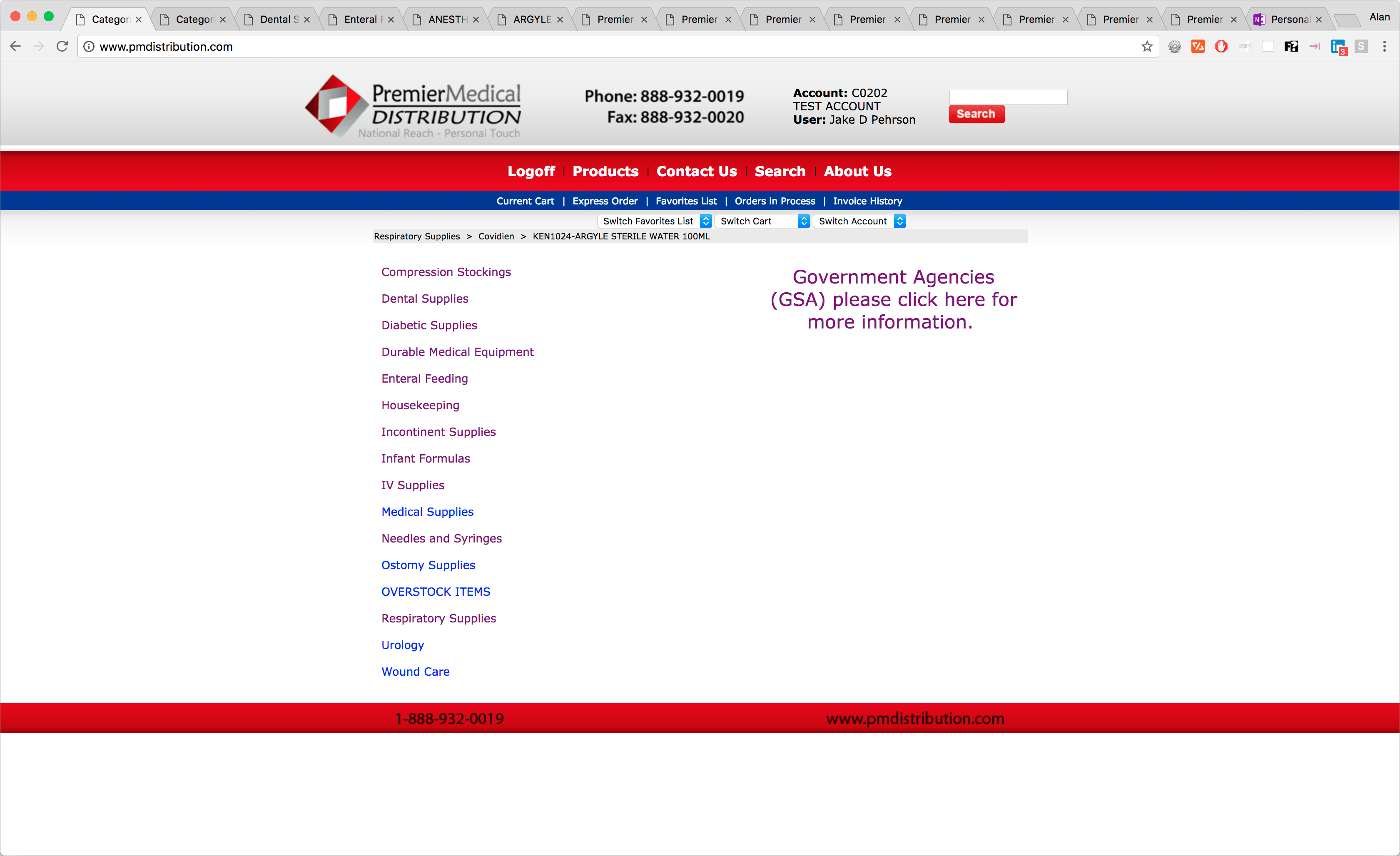
Navigation—The existing navigation was upside down and sideways. Conforming to the initial actions which users take, I restructured the navigation to facilitate their process, so they don’t have to think, just act.
- I rescued the Search from where it languished in obscurity - as the 4th of 5 primary navigation items - and placed it front and center, Amazon style, and placed the cursor in it on page load so the user could simply type their wish and see it appear.
- I promoted those items that represented primary functions—the product catalog, ordering screens, and tracking screens—to the main navigation
- I demoted the peripheral items, which weren’t needed by the users in the normal course of conducting their business, into the minor navigation.
- I separated the minor navigation, which was crowded together with the main navigation, and placed it where convention makes it easy to find.
- I moved the Sign In/Sign Out menu item to the far right—again, convention dictates this.
- I moved the cart up to its rightful position, giving it the recognition it deserves.
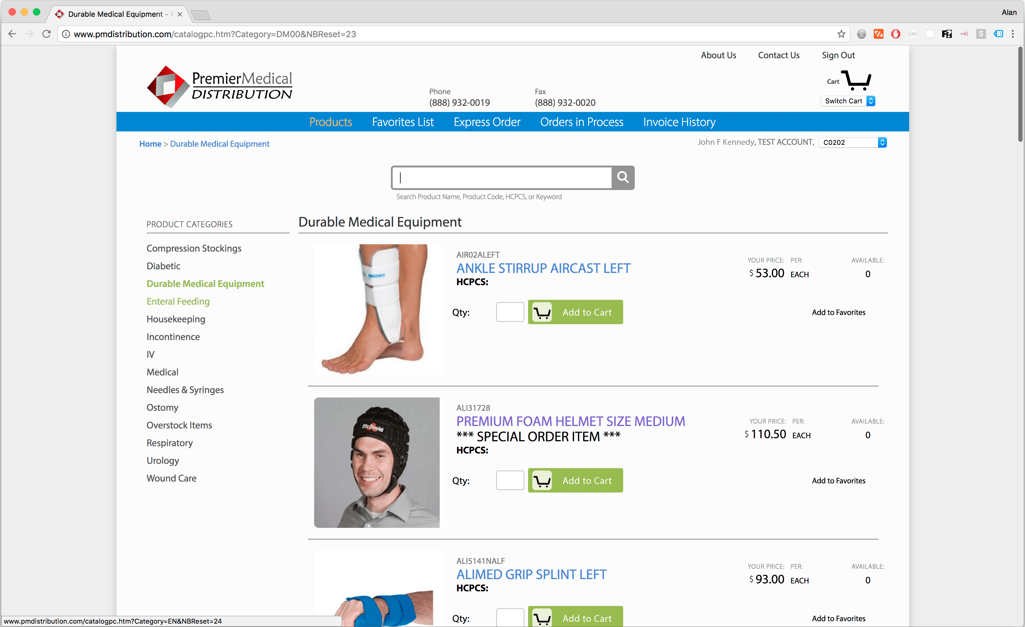
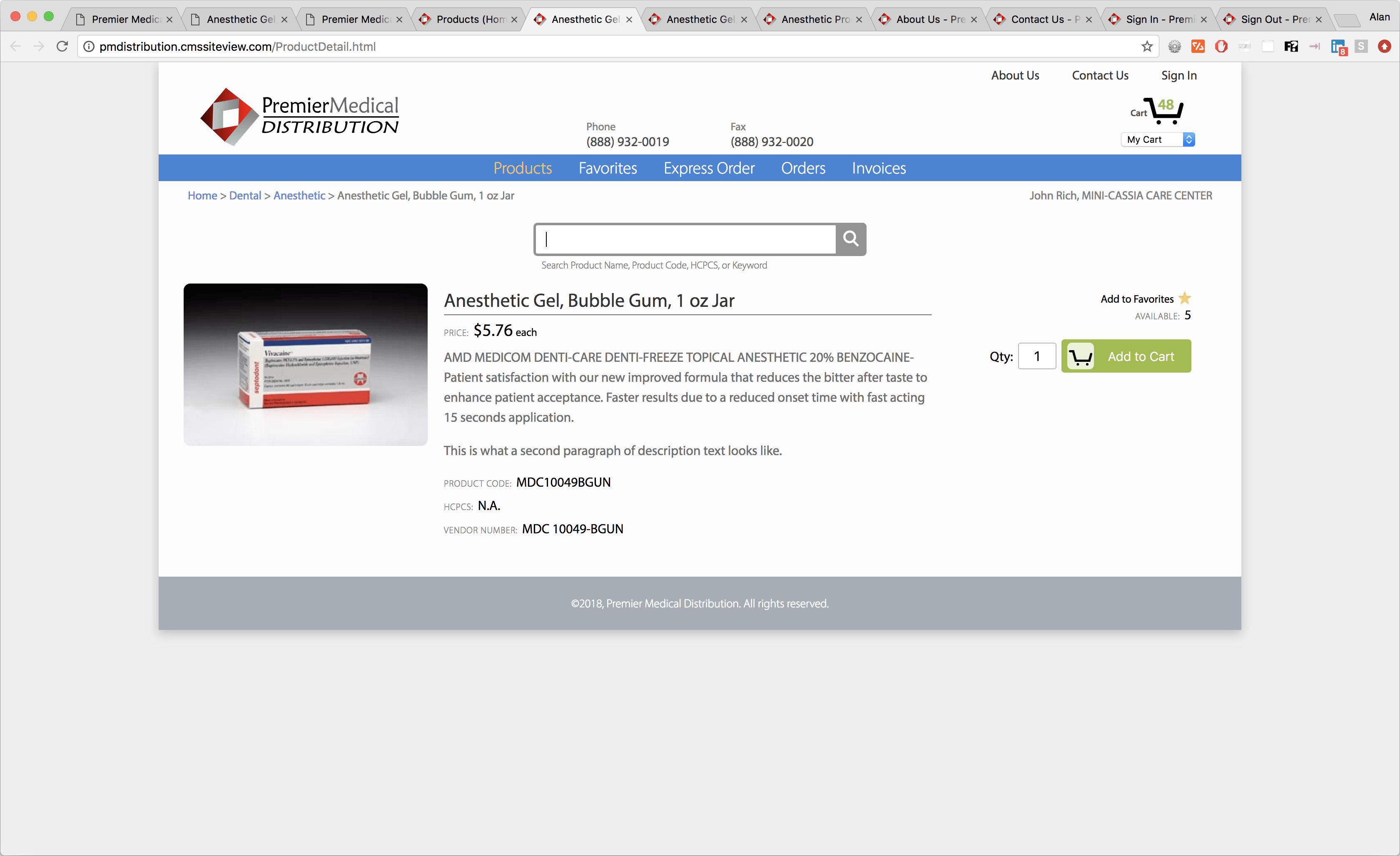
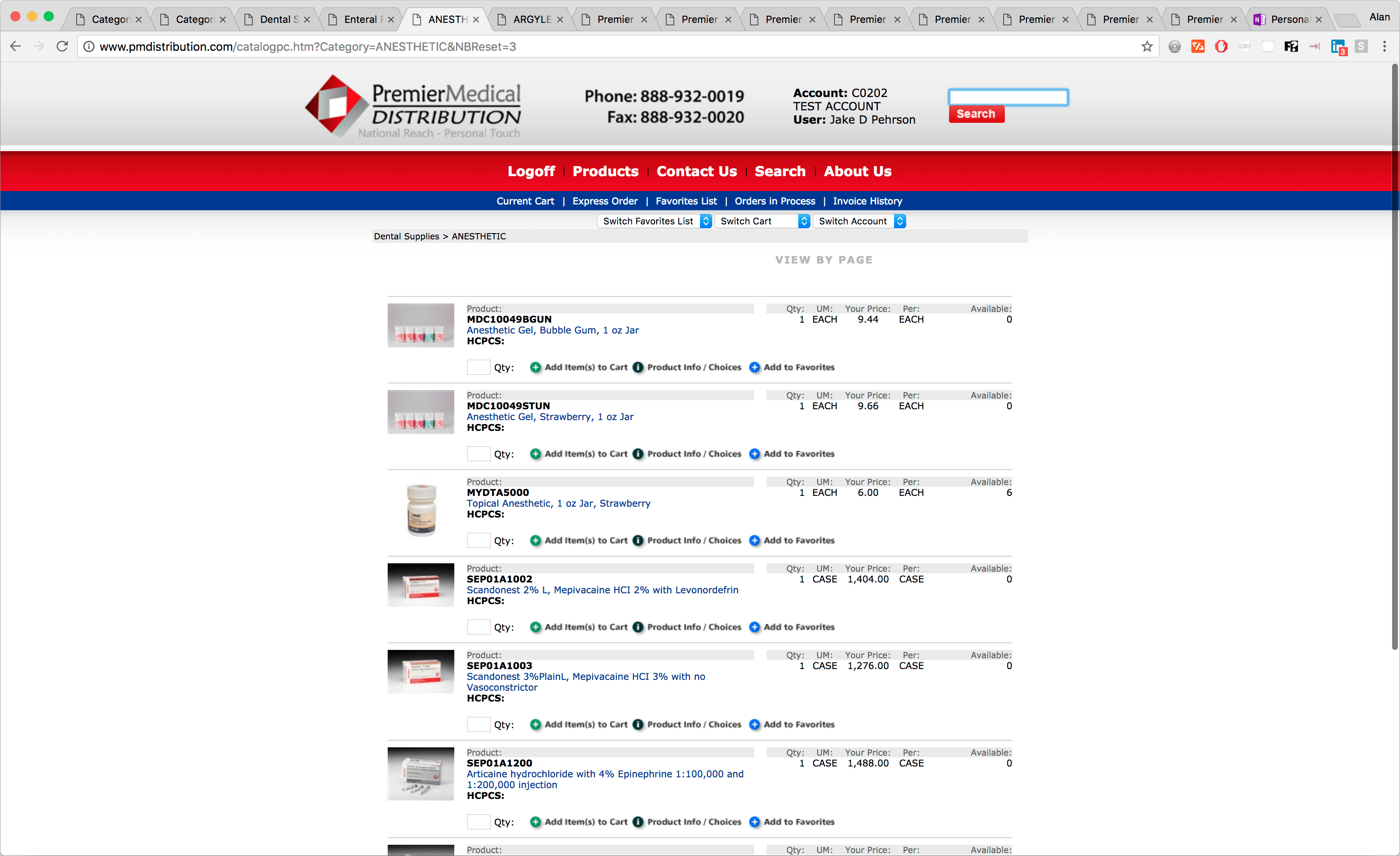
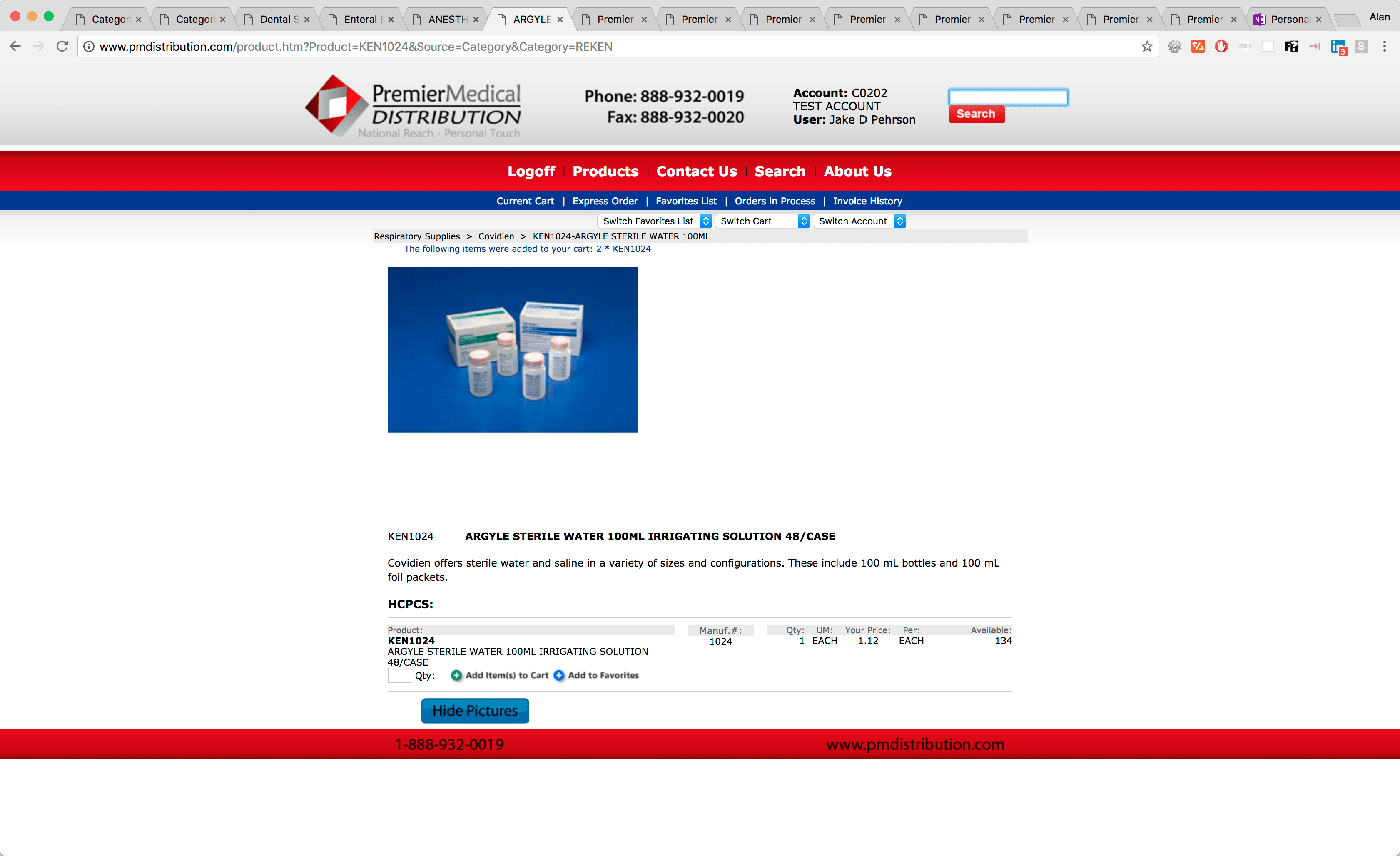
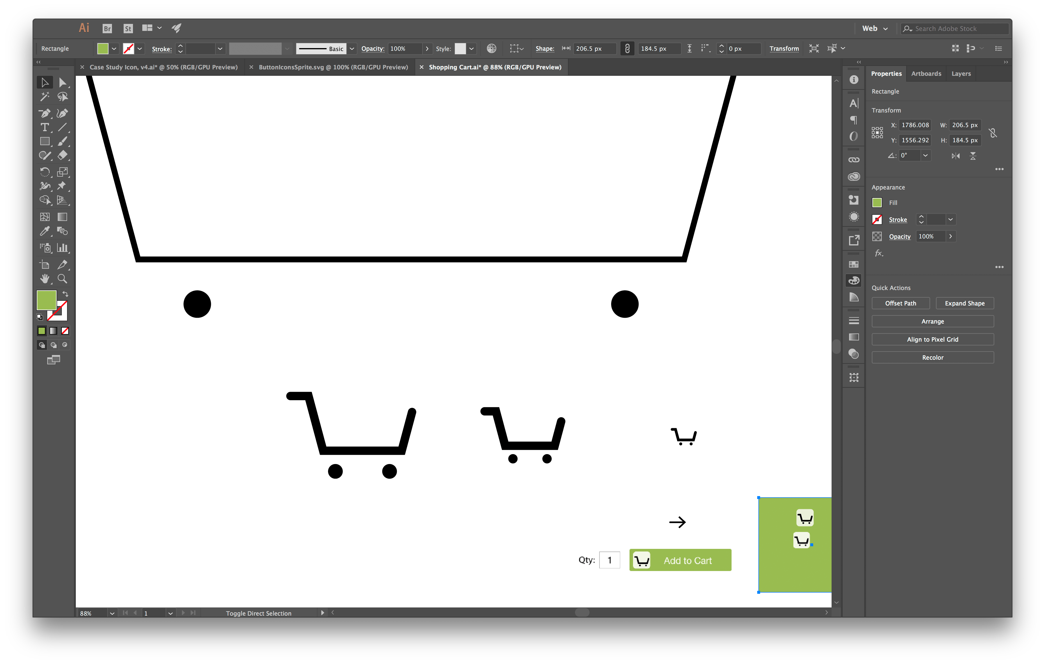
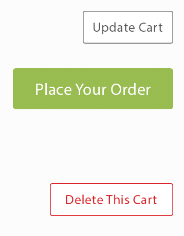
Products—In the product detail screen, and in the various lists of products, there was chaos and confusion. This is where the user decides if he wants the product and takes action. A confusing hierarchy of information, redundant labels, and diminished action buttons which lacked affordance made this key screen a chore for users. I reconstructed it, placing each element where a user would expect to find it, simplified, and made action buttons that are no-brainers.

Product Categories / Home Page—The existing home page did not account for visually-oriented navigators. I provided that key usability feature and greatly improved the look in the process.
User Interface Design
Again, there are too many decisions to describe, which contributed to this incredible transformation. But I will list a few of the key design choices to give you a taste.
Font—I switched to a well-designed, extremely legible, typeface—Myriad Pro—throughout the site. I increased the size and the line-height to improve legibility and reduce fatigue. I differentiated headings and labels and other types of information through size, color, and style to aid in comprehension of the information architecture.
Colors—I used a simple color palette which positioned the site as belonging to the medical supply sector. The colors also convey a contemporary feel, and add to the simple, clean sense which will help users to focus and get work done.
White Space and Alignment—Much of the improvement in comprehension is achieved through the judicious use of white space and the thoughtful alignment of elements to each other and a grid.
Size—The sizes of elements and text seemed to have no relationship to their meaning, and most of the text was smaller than it should be for ideal legibility. I drew on my expertise in typography and understanding of the information hierarchy to correct these errors.
Coding
The coding solution required assessing what could and could not be changed and leveraging the old and new coding methods to get the greatest results possible. I drew on my experience of all markup methods in the past to achieve this, including:
- clever CSS targeting of items without classes in unsemantic markup
- rewriting DIV elements as table elements and vice-versa
- writing Javascript to accomplish markup changes and interactive behavior that could not be done any other way without incurring great costs.
The Process
The schedule was tight, with 5 weeks in all to design, code, and integrate into the CMS. Furthermore, I was asked to design entirely based on input from key PMD staff about the users, with no access to the users themselves. There would be no typical user research on this project. As such, this project serves as a great object lesson in principles-driven design.
- I identified the concerns impacting the design:
- What were the personas?
- What were the actions that each persona would take?
- On what criteria did the success of those actions depend?
- What were the key pages and elements which served to assure that success?
- What elements and patterns could be reused from the primary pages and elements?
- What was the logical navigational hierarchy from the user's perspective?
- What was the logical hierarchy of information for each page from the user's perspective?
- What elements could be removed or combined to simplify the user experience?
- What elements needed to be added to improve the user experience?
- What categories, labels, buttons, or descriptions needed to be reworded to be better understood and minimize confusion?
- I created mockups of all representative pages using Adobe XD. I began adding elements to the screen, beginning with what I had identified as the key elements for the key page. To guide this design process, I drew on my lengthy history of experience in:
- Laying out screens
- Designing navigation
- Designing e-commerce experiences
Some of the design principles which governed this process were
- Communication
- Simplicity
- Hierarchy of Information
- Consistency
- Convention
- Object Permanence
- Predictability of Outcome
- Affordance
- Intuitiveness
- Explicitness
- Logical Categories
- Writing to not be misunderstood
- I presented the mockups of the key screens before continuing to the rest to avoid going too far in the wrong direction.
- Upon approval of the preliminary round of mockups, and then the final mockups (both of which came instantly - no hesitation), I began coding the mockups with HTML and CSS.
- I began the grueling process of integrating the new code into the tight constraints of the CMS.
- I interacted with the CMS provider to fix some issues with their system and to request minor changes which reaped big rewards.
- I reviewed the redesigned site regularly with my PMD stakeholder, including a final review after launch.
Results
The client was so pleased with their redesigned web site that they have already refered us to others in their field. Unfortunately, metrics were not an option with this project. And we are still waiting for user comments to be forwarded from the business. But that does not mean we are in the dark. Drawing on our understanding of design principles and on our experience with similar projects, we can judge for ourselves, indeed, the whole world can judge for themselves, that this web site redesign is a huge success!
